Showing posts with label gordon. Show all posts

Friday, October 23, 2009

Counting Users From Unique Cookies

Counting people/unique visitors/users at web sites is a challenge, and is something that I've been working on for the past couple of months for the web site of a large media company. The goal is to count the number of distinct users over the course of a month. Counting distinct cookies is easy; the challenge is turning these into human beings. These challenges include:

  • Cookie deletions. A user may manually delete their cookies one or more times during the month.

  • Disallowing first party cookies. A user may allow session cookies (while the browser is running), but not allow the cookies to be committed to disk.

  • Multiple browsers. A single user may use multiple browsers on the same machine during the month. This is particularly true when the user upgrades his or her browser.

  • Multiple machines. A single user may use multiple machines during the month.

And, I have to admit, that the data that I'm using has one more problem, which is probably not widespread. The cookies are actually hashed into four bytes. This means that it is theoretically possible for two "real" cookies to have the same hash value. Not only theoretically possible, but it happens (although not too frequently).

I came across a very good blog by Angie Brown that lays out the assumptions in making the calculation, including a spreadsheet for varying the assumptions. One particularly interesting factoid from the blog is that the number cookies that appear only once during the month exceeds the number of unique visitors, even under quite reasonable assumptions. Where I am working, one camp believes that the number of unique visitors is approximated by the number of unique cookies.


A white paper by ComCast states that the average user has 2.5 unique cookies per month due to cookie deletion. The paper is here, and a PR note about it is it is here. This paper is widely cited, although it has some serious methodological problems due to the fact that its data sources are limited to DoubleClick and Yahoo!.


In particular, Yahoo! is quite clear about its cookie expiration policies (two weeks for users clicking the "keep me logged in for 2 weeks" box and eight hours for Yahoo! mail). I do not believe that this policy has changed significantly in the last few years, although I am not 100% sure.


The white paper from ComCast does not mention these facts, which means that most of the cookies that a user has are due to automatic deletion, not user behavior. How many distinct cookies does a user have, due only to the user's behavior?

If I make the following assumptions:

  • The Yahoo! users have an average of 2.5 cookies per month.

  • ComCast used the main Yahoo! cookies, and not the Yahoo! mail cookies.

  • All Yahoo! users use the site consistently throughout the month.

  • All Yahoo! users have the "keep me logged in for 2 weeks" box checked.
Then I can estimate the number of cookies per user per machine per month. The average user would have 31/14 = 2.2 cookies per month, strictly due to the automatic deletion. This leaves 0.3 cookies per month due to manual deletion. Of course, the user starts with one cookie. So the average number of cookies per month per user per machine is 1.3.

By the way, I find this number much more reasonable. I also think that it misses the larger source of overcounting -- users who use more than one machine. Unfortunately, there is no single approach. In the case that I'm working on, we have the advantage that a minority of users are registered, so we can use them as a sample.


Tuesday, September 15, 2009

Adjusting for Oversampling

We recently received two similar questions about oversampling . . .

If you don´t mind, I would like to ask you a Question regarding Oversampling as you wrote in your book (Mastering Data Mining...).

I can understand how you calculate predictive lift when using oversampling, though don´t know how to do it for the confusion matrix.

Would you mind telling me how do I compute then the confusion matrix for the actual population (not the oversampled set)?

Thanks in advance for your reply and help.

Best,
Diego


Gentlemen-

I have severely unbalanced training data (180K negative cases, 430 positive cases). Yeah...very unbalanced.

I fit a model in a software program that allows instance weights (weka). I give all the positive cases a weight of 1 and all the negative cases a weight of 0.0024. I fit a model (not a decision tree so running the data through a test set is not an option to recalibrate) - like a neural network. I output the probabilities and they are out of whack - good for predicting the class or ranking but not for comparing predicted probability against actual.

What can we do to fit a model like this but then output probabilities that are in line with the distribution? Is this new (wrong) probabilities just the price we have to pay for instance weights to (1) get a model to build (2) get reasonably good classification? Can I have my cake and eat it too (classification and probs that are close to actual)?

Many many thanks!
Brian


The problem in these cases is the same. The goal is to predict a class, usually a binary class, where one outcome is rarer than the other. To generate the best model, some method of oversampling is used so the model set has equal numbers of the two outcomes. There are two common ways of doing this. Diego is probably using all the rare outcomes and an equal-sized random sample of the common outcomes. This is most useful when there are a large number of cases, and reducing the number of rows makes the modeling tools run faster. Brian is using a method where weights are used for the same purpose. Rare cases are given a weight of 1 and common cases are given a weight less than 1, so that the sum of the weights of the two groups is equal.

Regardless of the technique (neural network, decision trees, logistic regression, neearest neighbor, and so on), the resulting probabilities are "directionally" correct. A group of rows with a larger probability are more likey to have the modeled outcome than a group with a lower probability. This is useful for some purposes, such as getting the top 10% with the highest scores. It is not useful for other purposes, where the actual probability is needed.

Some tools can back into the desired probabilities, and do correct calculations for lift and for the confusion matrix. I think SAS Enterprise Miner, for instance, uses prior probabilties for this purpose. I say "think" because I do not actually use this feature. When I need to do this calculation, I do it manually, because not all tools support it. And, even if they do, why bother learning how. I can easily do the necessary calculations in Excel.

The key idea here is simply counting. Assume that we start with data that is 10% rare and 90% common, and we oversample so it is 50%-50%. The relationship between the original data and the model set is:
  • rare outcomes: 10% --> 50%
  • common outcomes: 90% --> 50%
To put it differently, each rare outcome in the original data is worth 5 in the model set. Each common outcome is worth 5/9 in the model set. We can call these numbers the oversampling rates for each of the outcomes.

We now apply these mappings to the results. Let's answer Brian's question for a particular situation. Say we have the above data and a result has a modeled probability of 80%. What is the actual probability?

Well, 25% means that there is 0.25 rare outcomes for 0.75 common ones. Let's undo the mapping above:
  • 0.80 / 5 = 0.16
  • 0.20 / (5/9) = 0.36
So, the expected probability on the original data is 0.16/(0.16+0.36) = 30.8%. Notice that the probability has decreased, but it is still larger than the 10% in the original data. Also notice that the lift on the model set is 80%/50% = 1.6. The lift on the original data is 3.08 (30.8% / 10%). The expected probability goes down, and the lift goes up.

This calculation can also be used for the cross-correlation matrix (or confusion matrix). In this case, you just have to divide each cell by the appropriate overampling rate. So, if the confusion matrix said:
  • 10 rows in the model set are rare and classified as rare
  • 5 rows in the model set are rare and classified as common
  • 3 rows in the model set are common and classified as rare
  • 12 rows in the model set are common and classified as common
(I apologize for not including a table, but that is more trouble than it is worth in the blog.)

In the original data, this means:
  • 2=10/5 rows in the original data are rare and classified as rare
  • 1=5/5 rows in the original data are rare and classified as common
  • 5.4 = 3/(5/9) rows inthe original data are common and classified as rare
  • 21.6 = 12/(5/9) rows in the original data are common and classified as common
These calculations are quite simple, and it is easy to set up a spreadsheet to do them.

I should also mention that this method readily works for any number of classes. Having two classes is simply the most common case.

Thursday, September 10, 2009

TDWI Question: Consolidating SAS and SPSS Groups

Yesterday, I had the pleasure of being on a panel for a local TDWI event here in New York focused on advanced analytics (thank you Jon Deutsch). Mark Madsen of Third Nature gave an interesting, if rapid-fire, overview of data mining technologies. Of course, I was excited to see that Mark included Data Analysis Using SQL and Excel as one of the first steps in getting started in data mining -- even before meeting me. Besides myself, the panel included my dear friend Anne Milley from SAS, Ali Pasha from Teradata, and a gentleman from Information Builders whose name I missed.

I found one of the questions from the audience to be quite interesting. The person was from the IT department of a large media corporation. He has two analysis groups, one in Los Angeles that uses SPSS and the other in New York that uses SAS. His goal, of course, is to reduce costs. He prefers to have one vendor. And, undoubtedly, the groups are looking for servers to run their software.

This is a typical IT-type question, particularly in these days of reduced budgets. I am more used to encountering such problems in the charged atmosphere of a client. The more relaxed atmosphere of a TDWI meeting perhaps gives a different perspective.

The groups are doing the same thing from the perspective of an IT director. Diving in a bit futher, the two groups do very different things -- at least from my perspective. Of course, both are using software running on computers to analyze data. The group in Los Angeles is using SPSS to analyze survey data. The group in New York is doing modeling using SAS. I should mention that I don't know anyone in the groups, and only have the cursory information provided at the TDWI conference.

Conflict Alert! Neither group wants to change and both are going to put up a big fight. SPSS has a stronghold in the market for analyzing survey data, with specialized routines and procedures to handle this data. (SAS probably has equivalent functionality, but many people who analyze survey data gravitate to SPSS.) Similarly, the SAS programmers in New York are not going to take kindly to switching to SPSS, even if offers the same functionality.

Each group has the skills and software that they need. Each group has legacy code and methods, that are likely tied to their tools. The company in question is not a 20-person start-up. It is a multinational corporation. Although the IT department might see standarizing a tool as beneficial, in actual fact, the two groups are doing different things and the costs of switching are quite high -- and might involve losing skilled people.

This issue brings up the question of what do we want to standardize on. The value of advanced analytics comes in two forms. The first is the creative process of identifying new and interesting phenomena. The second is the communication process of spreading the information where it is needed.

Although people may not think of nerds as being creative, really, we are. It is important to realize that imposing standards or limiting resources may limit creativity, and hence the quality of the results. This does not mean that cost control is unnecessary. Instead, it means that there are intangible costs that may not show up in a standard cost-benefit analysis.

On the other hand, communicating results through an organization is an area where standards are quite useful. Sometimes the results might be captured as a simple email going to the right person. Other times, the communication must go to a broader audience. Whether byy setting up an internal Wiki, updating model scores in a database, or loading a BI tool, having standards is important in this case. Many people are going to be involved, and these people should not have to learn special tools for one-off analyses -- so, if you have standardized on a BI tool, make the resources available to put in new results. And, from the perspective of the analysts, having standard methods of communicating results simplifies the process of transforming smart analyses into business value.

Monday, September 7, 2009

Principal Components: Are They A Data Mining Technique?

Principal components have been mentioned in passing several times in previous posts. However, I have not ever talked specifically about them, and their relationship to data mining in general.

What are principal components? There are two common definitions that I do not find particularly insightful. I repeat them here, mostly to illustrate the distance from important mathematical ideas and their application. The first definition is that the principal components are the eigenvectors of the covariance matrix of the variables. The eigenwhats of the what? Knowing enough German to understand that "eigen" means something like "inherent" does not really help in understanding this. An explanation of this -- with lots of mathematical symbols -- is available on Wikipedia. (And, it is not surprising that the inventor of covariance Karl Pearson also invented principal component analysis.)

The second definition (which is equivalent to the first) starts by imagining the data as points in space. Off all the possible lines in the space, the first principal component is the line that maximizes the variance of the points projected on the line (and also goes through the centroid of the data points). Points, lines, projections, centroids, variance -- that also sounds a bit academic. (By the way, for the seriously mathematically inclined, here are pointers to how these defintions are the same.)

I prefer a third, less commonly touted definition, which also assumes that data is spread out as points in space. Of all possible lines in space, the first principal component is the one that minimizes the square of the distance from each data point to the line. Hey, you may be asking, "isn't this the same as the ordinary least squares regression line?" The reason why I like this approach is because it compares principal components to something that almost everyone is familiar with -- the best-fit line. And that provides an opportunity to compare and contrast and learn.

The first difference between the two is both subtle and important. The best-fit line only looks at the distance from each data point to the line along one dimension; that is, the line minimizes the sum of the squares of the differences along the target dimension ("y"). The first principal component is looking at the sum of the squares of the overall distance. The "distance" in this case is the length of the shortest vector that connects each point to the line. In general, the best fit line and the first principal component, are not the same (and I'm curious if the angle between them might be useful). A little known factoid about best fit lines is worth dropping in here. Given a set of data points (x, y), the best fit line that fits y = f(x) is different from the best fit line that fits x = f(y). And the first principal component fits "between" these lines in some sense.

There is a corollary to this. For a best-fit line, one dimension is special, the "y" dimension, because that is how the distance is measured. This is typically the target dimension for a model, the values we want to predict. For the first principal component, there is no special dimension. Hence, principal components are most useful when applied only to input variables without the target. A major difference from best-fit lines.

For me, it makes intuitive sense that the line that best fits input values would be useful for analysis. And, it makes intuitive sense in a way that the eigen-whatevers of some matrix do not intuitively say "useful" or even that the line that maximizes the variance does not say "useful". Even though all are doing the same thing, some ways of explaining the concept seem more intuitive and applicable to data analysis.

Another difference from the best fit line involves what statisticians call residuals -- that is, the difference from each of the original data points to the corresponding point on the line. For a best-fit line, the residuals are simply numbers, the difference between the original "y" and the "y" on the line. For the first principal component, the residuals are vectors -- the vectors that connect each point perpendicularly to the line. These vectors can be plotted in space. And, given a bunch of points in space, we can calculate the principal component for them. This is the second principal component. And these have residuals, and the process can keep going, for a while, yielding the third principal component, and so on.

The first principal component and the second principal component have a very particular property; they are orthogonal to each other, which means that they meet at a right angle. In fact, all principal components are orthogonal to each other, and orthogonality is a good thing when working with input values for data. So, it is tempting to replace the data with the first few principal components. It is not only tempting, but this is often a successful way to reduce the number of variables used for analysis.

By the way, there are not an infinite number of principal components. The number of principal components is the dimensionality of the original data points -- which is never more than the number of variables that define each point.

There is much more to say about principal components. The original question asked whether they are part of data mining. I have never been particularly proud of what is and what is not data mining -- I'm happy to include anything useful for data analysis under the heading. Unlike other techniques, though, principal components are not a fancy method for building predictive or descriptive models. Instead, they are part of the arsenal of tools available for managing and massaging input variables to maximize their utility.

Friday, August 28, 2009

Shazam, A Case Study in Memory Based Reasoning (MBR)

Many users are probably aware of Shazam, one of the few mobile applications that really seems to live up to the notion "Wow! It's Magic." When you are listening to music, you can run the application (presumably on your phone), click "tag it", and after a few tens of seconds of listening and processing, Shazam will tell you what you are listening to, the artist and other details.

Recently, I found an interesting article describing how it works. A presentation, with more pictures and less text, is available here. Kudos to the company and to the author, Avery Wang, for providing technical detail.

The paper does a very good job explaining the details of the algorithm. My goal here is to describe the algorithm from a higher perspective, because it is an interesting example of a memory-based reasoning algorithm. That is, an algorithm that combines information from "nearest neighbors" to arrive at a prediction.

Assume that we have a database of songs and an excerpt that we want to find in a database of millions of songs. A first approach might be to do an exhaustive search of the database to find a match. This would take a long time.

Alternatively, we can frame the problem as follows: for all songs in the database, what is the longest period of time where the excerpt overlaps part of a song. The nearest neighbors are the ones with the longest period, and, in general, we would choose the single one with the longest overlap.

Simple problem to describe. However, the real world hits quickly. The songs are probably quite clean acoustically. However, the excerpt is subject to numerous problems: background noise, loss of fidelity due to compression as the excerpt is transmitted, poor (or at least different) equipment for recording the excerpt, and so on.

Fortunately, the world of acoustics has something of a solution for this, called the "frequency domain". This is a map of all the sound frequencies, taken at a periodic interval -- say, one second. If "frequency domain" conjures up memories of things like Fourier Transforms, then you really do understand the subject.

However, for our purposes, it is enough to say that the frequency domain for a song produces a very, very bumpy curve for each second of the song -- each point is the strength of a particular acoustic frequency at that point in the song. The song can be thought of as a collection of all these curves. Taken together, these curves might resemble a map of a very hilly area. This would be a three-dimensional map of the song.

This map has peaks anologous to the tops of hills (or perhaps the tops of buildings in a city). These peaks are called a constellations, and they pretty much uniquely identify the song, regardless of all the problems mentioned above. That is, the constellations are resilitient to background noise, loss of fidelity, and so on.

Of course, we can do this for the songs in the database in advance. And, we can do this processing for a single excerpt pretty quickly.

So, the problem of finding the song with the longest overlap in seconds with the excerpt is now handled by finding consecutive seconds in a song where the frequency domain peaks match the frequency domain peaks from the excerpt. This is still a daunting problem, because there are so many peaks available. In other word, comparing one excerpt to millions of songs requires comparing hundreds of peaks in the excerpts to the many, many billions in the database -- very time consuming.

Shazam takes a very clever approach to this problem. The algorithm treats each peak as an anchor, and creates peak-pairs with other peaks "close" to the anchor. Here, "close" means that the other peaks are within a few seconds of the first and not too different in frequency. These peak-pairs are then calculated for both the song and the excerpt. The pairs are used to find sets of anchors that match between each song and the excerpt. Because the algorithm is looking for exact matches, it can use some programming tricks to make things even faster (these are described in the paper).

In the end, there is a set of anchors for each song matched by a given excerpt. For each song, these are scanned to find consecutive seconds where the anchors in each second overlap. The longest period of overlap is the distance between the excerpt and the song.

The algorithm is quite clever on several different levels. I do think that understanding it at a high level is valuable, especially since it can provide guidance to other very difficult recognition problems. On the other hand, when I use Shazam and it identifies a song, I still think it's magic.

Tuesday, August 25, 2009

Neural Networks, Predicting Continuous Values

Hi!
Very good blog...
I'm doing some stuff with Clementine... and I have an issue...
My target for NN train dataset is a continuos value between 0 and 100... the problem is that is a normal/gaussian distribution and makes the NN predict bad...

How can I resolve the unbalancing data? split into classe with same frequency!?

Regards,
Pedro

Pedro,

I am not aware that neural networks have a problem with predicting values with normal distributions. In fact, if you randomize the weights in a neural network whose output layer has a linear transfer function, then the output is likely to follow a normal distribution -- just from the Central Limit Theorem of statistics.

So, you have a neural network that is not producing good results. There can be several causes.

The first thing to look for is too many inputs. Clementine has options to prune the input variables on a neural network. Be sure that you do not have too many inputs. I would recommend a variable reduction technique such as principal components, and advise you to avoid categorical variables that have many levels.

A similar problem can occur if your hidden layer is too large.

Whatever the network, it is worthwhile looking at the number of weights in the network (or a related measure called the degrees of freedom). Remember, you want to have lots of training data for each weight.

Another problem may be that the target is continuous, but bounded between 0 and 100. This could result in a neural network where the output layer uses a linear transfer function. Although not generally a bad idea, it may not work in this case because the range of a linear function is from minus infinity to positive infinity, which far exceeds the range of the data.

One simple solution would be to divide the output by 100 and treat it as a probability. The neural network should then be set up with a logistic function in the target layer.

Your idea of binning the results might also work, assuming that bins work for solving the business problem. Equal sized bins are reasonable, since they are readily understandable as quantiles.

Good luck.

Sunday, August 9, 2009

Pharmaceutical Data and Privacy

Today's New York Times has another misguided article on privacy in the medical world. This article seems to be designed to scare Americans into believing that health care privacy is endangered, and that such data is regularly and wantonly traded among companies.

My perspective is different, since I am coming from the side of analyzing data.

First, the pharmaceutical industry is different from virually every other industry in the United States. For the most part, it is illegal for pharmaceutical manufacturers to identify the users of their products. This is based originated with the Health Information Portability and Privacy Act (HIPAA), explained in more detail at this government site.

What is absurd about this situation is that pharmaceutical companies are, in theory, responsible for the health of the millions of people who use their products. To give an example of the dangers, imagine that you have a popular product that causes cardiac damage after several months of use. The cardiac damage, in turn, is sometimes fatal. How does the manufacturer connect the use of the product to death registries? The simple answer. They cannot.

This is not a made-up example. Millions of people used Cox-2 inhibitors, which were on the market until 2004, when Merck voluntarily took Vioxx off the market. This issue here is whether the industry could have known earlier that such dangers lurked in the use of the drug. My contention is that the manufactureres do not have a chance, because they could not do something that virutally every other company can do -- match their customer records to publicly available mortality records.

To be clear about the laws related to drugs. If someone has an adverse reaction while on a drug, then that must be reported to the pharmaceutical company. However, if the adverse reaction is detected a certain amount of time after the patient stops therapy (I believe two weeks), then there is not reporting requirement. Guess what. Cardiac damage caused by Cox-2 inhibitors does not necessarily kill patients right away. Nor is the damage necessarily detected while the patient is still on the therapy.

I have used deidentified records at pharmaceutical clients for various analyses that have ranged from the amusing (anniversary effects in the scripts for ED therapies) to the socially useful (do poor patients have less adherence due to copayments) to the actionable (what messages to give to prescribers). In all cases, we have had to do more work than necessary because of the de-identification requirements, and to make assumptions and work-arounds that may have hurt the analyses. And, contrary to what the New York Times article may lead you to believe, both IMS and Verispan take privacy very seriously. Were I inclined to try to identify particular records, it would be virtually impossible.

Every time a drug is used, there is perhaps an opportunity to learn about its effectiveness and interactions with other therapies. In many cases, these are questions that scientists do not even know to ask, and such exploratory data mining can be critical in establishing hypotheses. Questions such as:
  • Are the therapies equally effective, regardless of gender, age, race, and geography?
  • Do demographics affect adherence?
  • What interactions does a given therapy have with other therapies?
  • Does the use of a particular therapy have an effect on mortality?
Everytime patients purchase scripts and the data is shielded from the manufacturers, opportunities to better understand and improve health care outcomes are lost. Even worse, asa the New York Times article points out, HIPAA does not protect consumers from the actions of nefarious employees and adroit criminals. There has to be a better way.

Monday, July 27, 2009

Time to Event Models, When the Event Is Not Churn

Dear Data Miners,

I am trying to build a churn model to predict WHEN customers will become paying members.
Process:

1. Person comes to our web site.
2. They register for free to use the site.
3. If the want to have more access to the site and use more features they pay us.

What are the issues I should consider when I decide to set a cut date. The first step towards censoring the data.

For a classic churn model , we want to know when someone will stop paying us and leave our phone company. We censor those that we don’t know their final status pass our censor point.

I want to know when they will pay us and censor those I don’t know if they will pay us in the future.

Is the cut date choice arbitrary or is there some sampling rule?

Thank you;
Daryl

Daryl,

Your example is a time-to-event model that does not represent churn. There are many such examples in business (and this is something discussed in Data Analysis Using SQL and Excel in a bit of depth).

Think of your situation as two different time-to-event problems:

(1) A person visits the web site, what happens next? Does the person return to the web site or register? This is a time-to-event problem and analysis can provide information on customer registrations, particularly the lag between the initial visit and the registration.

(2) A person registers for free, how long until that person buys something? This can provide insight on paying visitors.

Once you have broken the problem into these pieces, imagining the customer signature is easier. For the first problem, the customer signature is a picture of customers when they initially visit (or for each pre-registration visit, for a time-to-next event problem). The "prediction" columns are the date of the registration (or for time-to-event, the date of the next visit and whether it involves a registration).

The second component is a picture of the customer when they first register, and the prediction columns are when (and whether) the customer every pays for anything. In this case, it is very important to treat this as a time-to-event problem, because older registrations have had more opportunity to pay for something and the analysis needs to take this into account.

As for the censor date, it is the most recent date of the data. So, if you have data through the end of yesterday, then that is the censor date. For instance, for the second component of the analysis, customers who registered before yesterday but never paid would have their outcomes censored (these customers have not paid yet but they may pay in the future).

Friday, June 26, 2009

When Customers Start and End

In texts on credit scoring, some effort almost always goes into defining what is to be considered as a "bad" credit. The Basel framework provides rather a precise definition of what is to be considered a default.

But I have rarely seen the same in predicting cross-sell, up-sell or churn. I do however, remember attending an SPSS conference where churn of pre-paid cards was discussed. Churn, in that case, was defined as a number of consecutive periods where the number of calls fell below a certain level.

In the past, I've used start and end dates of contracts, as well as a simple increase (or decrease) in the number of products that a customer has over time as indicators of what to target.

I'd be really interested in hearing how you define and extract targets, be it in telecom, banking, cards or any other business where you use prediction. For instance, how would you go looking for customers that have churned? Or for that matter, customers where up-sell has been successful?

This may be too simple a question, but if there are standard methods that you use, I'd be really interested in learning about them.
--Ola


Ola,

This is not a simple question at all. Or rather, the simplest questions are often the most illuminating.

The place where I see the biggest issues in defining starts and stops is in survival data mining (obligatory plug for my book Data Analysis Using SQL and Excel, which has two chapters on the subject). For the start date, I try to use (or approximate as closely as possible) the date when two things have occurred: the company has agreed to provide a product or service, and the customer has agreed to pay for it. In the case of post-pay telecoms, this would be the activation date -- and there are similar dates in many other industries, as varied as credit cards, cable subscriptions, and health insurance.

The activation date is often well-defined because the number of active customers gets reported through some system tied to the financial systems. Even so, there are anomalies. I recently completed a project at a large newspaper, and used their service start date as the activation date. Alas, at time, customers with start dates did not necessarily actually receive the paper on the date -- often because the newspaper delivery person could not find the address.

The stop date is even more fraught with complication, because there are a variety of different dates to choose from. For voluntary churn, there is the date the customer requests termination of the service. There is also the date when the service is actually turned off. Which to use? It depends on the application. To count active customers, we want the service cut-off date. To plan for customer retention efforts, we want to know when they call in.

Involuntary churn is also complicated, because there are a series of steps, often called the Dunning Process, which keeps track of customers who do not pay. At what point does a non-paying customer stop? When the service stops? When the bill is written off or settled? At some arbitrary point, such as 60 or 90 days of non-payment? To further confuse the situation, the business may change its rules over time. So, during some periods of time or for some customers, 60 days of non-payment results in service cutoff. For other periods or customers, 90 days might be the rule.

Often, I find multiple time-to-event problems in this scenario. How long does it take a non-paying customer to stop, if ever? How long after customers sign up do they begin?

In your particular case, the contract start date is probably a good place to start. However, the contract end date might or might not be appropriate, since this might not be updated to reflect when a customer actually stops.

--gordon

Monday, June 8, 2009

Confidence in Logistic Regression Coefficients

I work in the marketing team of a telecom company and I recently encountered an annoying problem with an upsell model. Since the monthly sale rate is less than 1% of our customer base, I used oversampling as you mentioned in your book ‘Mastering data mining’ with data over the last 3 sales months so that I had a ratio of about 15% buyers and 85% non-buyers (sample size of about 20K). Using alpha=5%, I got parameter estimates which were from a business perspective entirely explicable. However, when I then re-estimated the model on the total customer base to obtain the ‘true’ parameter estimates which I will use for my monthly scoring two effects were suddenly insignificant at alpha=5%.

I never encountered this and was wondering what to do with these effects: should I kick them out of the model or not ? I decided to keep them in since they did have some business meaning and concluded that they must have become insignificant since it is only a micro-segment in your entire population.
To your opinion, did I interpret this correctly ? . . .
Many thanks in advance for your advice,
Wendy


Michael responds:

Hi Wendy,

This question has come up on the blog before. The short answer is that with a logistic regression model trained at one concentration of responders, it is a bit tricky to adjust the model to reflect the actual probability of response on the true population. I suggest you look at some papers by Gary King on this topic.


Gordon responds:

Wendy, I am not sure that Prof. King deals directly with your issue, of changing confidence in the coefficients estimates. To be honest, I have never considered this issue. Since you bring it up, though, I am not surprised that it may happen.

My first comment is that the results seem usable, since they are explainable. Sometimes statistical modeling stumbles on relationships in the data that make sense, although they may not be fully statistically significant. Similarly, some relationships may be statistically significant, but have no meaning in the real world. So, use the variables!

Second, if I do a regresson on a set of data, and then duplicate the data (to make it twice as big) and run it again, I'll get the same estimates as on the orignal data. However, the confidence in the coefficients will increase. I suspect that something similar is happening on your data.

If you want to fix that particular problem, then use a tool (such as SAS Enterprise Miner and probably proc logistic) that supports a frequency option on each row. Set the frequency to one for the more common events and to an appropriate value less than one for more common events. I do this as a matter of habit, because it works best for decision trees. You have pointed out that the confidence in the coefficients is also affected by the frequencies, so this is a good habit with regressions as well.


Sunday, May 10, 2009

Not Enough Data

An article in yesterday's New York Times reminded me of examples of "bad" examples of data mining. By bad examples, I mean that spurious correlations are given credence -- enough credence to make it into a well-reputed national newspaper.

The article, entitled "Eat Quickly, for the Economy's State" is about a leisure time report from the OECD that shows a correlation between the following two variables:
  • Change in real GNP in 2008; and,
  • Amount of time people spend eating and drinking in a given day.
The study is based on surveys from 17 countries (for more information on the survey, you can check this out).

The highlight is a few charts that shows that countries such as Mexico, Canada, and the United States have the lowest time spent eating (under 75 minutes per day) versus countries such as New Zealand, France, and Japan (over 110 minutes per day). The first group of countries have higher growth rates, both in 2008 and for the past few years.

My first problem with the analysis is one of granularity. Leisure time is measured per person, but GNP is measured over everyone. One big component of GNP growth is population growth, and different countries have very different patterns of population growth. The correct measure would be per capital GNP. Taking this into account would dampen the GNP growth figures for growing countries such as Mexico and the United States, and increase the GNP growth figures for lesser growing (or shrinking countries) such as Italy, Germany, and Japan.

Also, the countries where people eat more leisurely have other characteristics in common. In particular, they tend to have older populations and lower (or even negative) rates of population growth. One wonders if speed eating is a characteristic of younger people and leisurely eating is a characteristic of older people.

The biggest problem, though, is that this is, in all likelihood, a spurious correlation. One of the original definitions of data mining, which may still be used in the ecoonomics and political world, is a negative one: data mining is looking for data to support a conclusion. The OECD surveys were done in 17 different countries. The specific result in the NYT article is "Counties in which people eat and drink less than 100 minutes per day grow 0.9% faster -- on average -- than countries in which people each and drink more than 100 minutes per day".

In other words, the 17 countries were divided into two groups, and the growth rates were then measured for each group. Let's look at this in more detail.

How many ways are there to divide 17 countries into 2 groups? The answer is 2^17 = 131,072 different ways (any particular country could be in either group). So, if we had 131,072 yes-or-no survey questions, then would would expect any combination to arise, including the combinations where all the high growth countries are in one group and all the low growth countries in the other. (I admit the exact figure is a bit more than 131,072 but that is unimportant to illustrate my point.)

The situation actually gets worse. The results are not yes-or-no; they are numeric measurements which are then used to split the countries into two groups. The splits could be at any value of the measure. So, any given measurement results in 17-1=16 different possible splits (the first group having the country with the lowest measurement, with the two lowest, and so on). Now we only need about 8,192 uncorrelated measurements to get all possibilities.

However, we do not need all possibilities. A glance at the NYT article shows that the country with the worst 2008 growth is Poland, yet it is in the fast-eating group. And Spain -- in the slow eating group -- is the third fastest growing economy (okay, its GNP actually shrank but less than most others). So, we only need an approximation of a split, where the two groups look different. And then, voila! we get a news article.

The problem is that the OECD was able to measure dozens or hundreds of different things in their survey. My guess is that measures such as "weekly hours of work in main job," "time spent retired," and "time spent sleeping" -- just a few of the many possibilities -- did not result in interesting splits. Eventually, though, a measure such as "time spent eating and drinking" results in a split where the different groups look "statistically significant" but they probably are not. If the measure is interesting enough, then it can become an article in the New York Times.

This is probably a problem with statistical significance. The challenge is that a p-value of 0.01 means that something has only a 1% chance of happening at random. However, if we look at 100 different measures, then there is a really, really good chance that one of them will have a p-value of 0.01 or less. By the way, there is a statistical adjustment called the Bonferroni correction to take this into account (this as well as others are described in the Wikipeida).

Fortunately, neither the OECD nor the New York Times talk about this discovery as an example of data mining. It is just poor data analysis, but poor data analysis that can re-enforce lessons in good data analysis. Lately, I have been noticing more examples of articles such as this, where researchers -- or perhaps just journalists -- extrapolate from very small samples to make unsupported conclusions. These are particularly grating when they appear in respected newspapers, magazines, and journals.

Data mining is not about finding spurious correlations and claiming some great discovery. It is about extracting valuable information from large quantities of data, information that is stable and useful. Smaller amounts of data often contain many correlations. Often, these correlations are going to be spurious. And without further testing, or at least a mechanism to explain the correlation, the results should not be mentioned at all.

Saturday, April 25, 2009

When There Is Not Enough Data

I have a dataset where the target (continuous variable) variable that has to be estimated. However, in the given dataset, values for target are preset only for 2% while rest of 98% do not have values. The 98% are empty values. I need to score a dataset and give values for the target for all 2500 records. Can I use the 2% and replicate it several times and use that dataset to build a model? The ASE is too high if I use the 2% data alone. Any suggestions how to handle it, please?
Thanks,
Sneha

Sneha,

The short answer to your question is "Yes, you can replicate the 2% and use it to build a model." BUT DO NOT DO THIS! Just because a tool or technique is possible to implement does not mean that it is a good idea. Replicating observations "confuses" models, often by making the model appear overconfident in its results.

Given the way that ASE (average squared error) is calculated, I don't think that replicating data is going to change the value. We can imagine adding a weight or frequency on each observation instead of replicating them. When the weights are all the same, they cancel out in the ASE formula.

What does change is confidence in the model. So, if you are doing a regression and looking at the regression coefficients, each has a confidence interval. By replicating the data, the resulting model would have smaller confidence intervals. However, these are false, because the replicated data has no more information than the original data.

The problem that you are facing is that the modeling technique you are using is simply not powerful enough to represent the 50 observations that you have. Perhaps a different modeling technique would work better, although you are working with a small amount of data. For instance, perhaps some sort of nearest neighbor approach would work well and be easy to implement.

You do not say why you are using ASE (average squared error) as the preferred measure of model fitness. I can speculate that you are trying to predict a number, perhaps using a regression. One challenge is that the numbers being predicted often fall into a particular range (such as positive numbers for dollar values or ranging between 0 and 1 for a percentage). However, regressions produce numbers that run the gamut of values. In this case, transforming the target variable can sometimes improve results.

In our class on data mining (Data Mining Techniques: Theory and Practice), Michael and I introduce the idea of oversamping rare data using weights in order to get a balanced model set. For instance, if you were predicting whether someone was in the 2% group, you might give each of them a weight of 49 and all the unknowns a weight of 1. The result would be a balanced model set. However, we strongly advise that the maximum weight be 1. So, the weights would be 1/49 for the common cases and 1 for the rare ones. For regressions, this is important because it prevents any coefficients from having too-narrow confidence intervals.


Sunday, January 18, 2009

Thoughts on Understanding Neural Networks

Lately, I've been thinking quite a bit about neural networks. In particular, I've been wondering whether it is actually possible to understand them. As a note, this posting assumes that the reader has some understanding of neural networks. Of course, we at Data Miners, heartily recommend our book Data Mining Techniques for Marketing, Sales, and Customer Relationship Management for introducing neural networks (as well as a plethora of other data mining algorithms).

Let me start with a picture of a neural network. The following is a simple network that takes three inputs and has two nodes in the hidden layer:
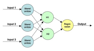
Note that this structure of the network explains what is really happening. The "input layer" (the first layer connected to the inputs) standardizes the inputs. The "output layer" (connect to the output) is doing a regression or logistic regression, depending on whether the target is numeric or binary. The hidden layers are actually doing a mathematical operation as well. This could be the logistic function; more typically, though it is the hyperbolic tangent. All of the lines in the diagram have weights on them. Setting these weights -- plus a few others not shown -- is the process of training the neural network.

The topology of the neural network is specifically how SAS Enterprise Miner implements the network. Other tools have similar capabilities. Here, I am using SAS EM for three reasons. First, because we teach a class using this tool, I have pre-built neural network diagrams. Second, the neural network node allows me to score the hidden units. And third, the graphics provide a data-colored scatter plot, which I use to describe what's happening.

There are several ways to understand this neural network. The most basic way is "it's a black box and we don't need to understand it." In many respects, this is the standard data mining viewpoint. Neural networks often work well. However, if you want a technique that let's you undersand what it is doing, then choose another technique, such as regression or decision trees or nearest neighbor.

A related viewpoint is to write down the equation for what the network is doing. Then point out that this equation *is* the network. The problem is not that the network cannot explain what it is doing. The problem is that we human beings cannot understand what it is saying.

I am going to propose two other ways of looking at the network. One is geometrically. The inputs are projected onto the outputs of the hidden layer. The results of this projection are then combined to form the output. The other method is, for lack of a better term, "clustering". The hidden nodes actually identify patterns in the original data, and one hidden node usually dominates the output within a cluster.

Let me start with the geometric interpretation. For the network above, there are three dimensions of inputs and two hidden nodes. So, three dimensions are projected down to two dimensions.

I do need to emphasize that these projections are not the linear projections. This means that they are not described by simple matrices. These are non-linear projections. In particular, a given dimension could be stretched non-uniformly, which further complicates the situation.

I chose two nodes in the hidden layer on purpose, simply because two dimensions are pretty easy to visualize. Then I went and I tried it on a small neural network, using Enterprise Miner. The next couple of pictures are scatter plots made with EM. It has the nice feature that I can color the points based on data -- a feature sadly lacking from Excel.

The following scatter plot shows the original data points (about 2,700 of them). The positions are determined by the outputs of the hidden layers. The colors show the output of the network itself (blue being close to 0 and red being close to 1). The network is predicting a value of 0 or 1 based on a balanced training set and three inputs.
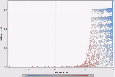
Hmm, the overall output is pretty much related to the H1 output rather than the H2 output. We see this becasuse the color changes primarily as we move horizontally across the scatter plot and not vertically. This is interesting. It means that H2 is contributing little to the network prediction. Under these particular circumstances, we can explain the output of the neural network by explaining what is happening at H1. And what is happening at H1 is a lot like a logistic regression, where we can determine the weights of different variables going in.

Note that this is an approximation, because H2 does make some contribution. But it is a close approximation, because for almost all input data points, H1 is the dominant node.

This pattern is a consequence of the distribution of the input data. Note that H2 is always negative and close to -1, whereas H1 varies from -1 to 1 (as we would expect, given the transfer function). This is because the inputs are always positive and in a particular range. The inputs do not result in the full range of values for each hidden node. This fact, in turn, provides a clue to what the neural network is doing. Also, this is close to a degenerate case because one hidden unit is almost always ignored. It does illustrate that looking at the outputs of the hidden layers are useful.

This suggests another approach. Imagine the space of H1 and H2 values, and further that any combination of them might exist (do remember that because of the transfer function, the values actually are limited to the range -1 to 1). Within this space, which node dominates the calculation of the output of the network?

To answer this question, I had to come up with some reasonable way to compare the following values:
  • Network output: exp(bias + a1*H1 + a2*H2)
  • H1 only: exp(bias + a1*H1)
  • H2 only: exp(bias + a2*H2)
Let me give an example with numbers. For the network above, we have the following when H1 and H2 are both -1:
  • Network output: 0.9994
  • H1 only output: 0.9926
  • H2 only output: 0.9749
To calculate the contribution of H1, I use the ratio of the sums of the squares of the differences, as in the following example for H1:
  • H1 contribution: (0.9994 - 0.9926)^2 / ((0.9994 - 0.9926)^2 + (0.9994 - 0.9749)^2)
The following scatter plot shows the regions where H1 dominates the overall prediction of the network using this metric (red is H1 is dominant; blue is H2 is dominant):
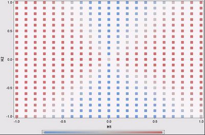

There are four regions in this scatter plot, defined essentially by the intersection of two lines. In fact, each hidden node is going to add another line on this chart, generating more regions. Within each region, one node is going to dominate. The boundaries are fuzzy. Sometimes this makes no difference, because the output on either side is the same; sometimes it does make a difference.

Note that this scatter plot assumes that the inputs can generate all combinations of values from the hidden units. However, in practice, this is not true, as shown on the previous scatter plot, which essentially covers only the lowest eights of this one.

With the contribution metric, we can then say that for different regions in the hidden unit space, different hidden units dominate the output. This is essentially saying that in different areas, we only need one hidden unit to determine the outcome of the network. Within each region, then, we can identify the variables used by the hidden units and say that they are determining the outcome of the network.

This idea leads to a way to start to understand standard multilayer perceptron neural networks, at least in the space of the hidden units. We can identify the regions where particular hidden units dominate the output of the network. Within each region, we can identify which variables dominate the output of that hidden unit. Perhaps this explains what is happening in the network, because the input ranges limit the outputs only to one region.

More likely, we have to return to the original inputs to determine which hidden unit dominates for a given combination of inputs. I've only just started thinking about this idea, so perhaps I'll follow up in a later post.

--gordon

Wednesday, January 14, 2009

Neural Network Training Methods

Scott asks . . .

Dear Ask a Data Miner,


I am using SPSS Clementine 12. The Neural Network node in Clementine allows users to choose from six different training methods for building neural network models:

• Quick. This method uses rules of thumb and characteristics of the data to choose an appropriate shape (topology) for the network.

• Dynamic. This method creates an initial topology but modifies the topology by adding and/or removing hidden units as training progresses.

• Multiple. This method creates several networks of different topologies (the exact number depends on the training data). These networks are then trained in a pseudo-parallel fashion. At the end of training, the model with the lowest RMS error is presented as the final model.

• Prune. This method starts with a large network and removes (prunes) the weakest units in the hidden and input layers as training proceeds. This method is usually slow, but it often yields better results than other methods.

• RBFN. The radial basis function network (RBFN) uses a technique similar to k-means clustering to partition the data based on values of the target field.

• Exhaustive prune. This method is related to the Prune method. It starts with a large network and prunes the weakest units in the hidden and input layers as training proceeds. With Exhaustive Prune, network training parameters are chosen to ensure a very thorough search of the space of possible models to find the best one. This method is usually the slowest, but it often yields the best results. Note that this method can take a long time to train, especially with large datasets.

Which is your preferred training method? How about for a lot of data - (a high number of cases AND a high number of input variables)? How about for a relatively small amount of data?


Scott,

Our general attitude with respect to fancy algorithms is that they provide incremental value. However, focusing on data usually provides more scope for improving results. This is particularly true of neural networks, because stable neural networks should have few inputs.

Before addressing your question, there are a few things that you should keep in mind when using neural networks:

(1) Standardize all the inputs (that is, subtract the average and divide by the standard deviation). This puts all numeric inputs into a particular range.

(2) Avoid categorical inputs! These should be replaced by appropriate numeric descriptors. Neural network tools, such as Clementine, handle categorical inputs using something called n-1 coding, which converts one variable into many flag variables, which, in turn, multiplies the number of weights in the network that need to be optimized.

(3) Avoid variables that are highly collinear. These cause "multidimensional ridges" in the space of neural network weights, which can confuse the training algorithms.

To return to your question in more detail. Try out lots of the different approaches to determine which is best! There is no rule that says that you have to decide on one approach initially and stick with it. To test the approaches use a separate partition of the data to see which works best.

For instance, the Quick method is probably very useful in getting results back in a reasonable amount of time. Examine the topology, though, to see if it makes sense (no hidden units or too many hidden units). Most of the others are all about adding or removing units, which can be valuable. However, always test the methods on a test set that is not used for training. The topology of the network may depend on the training set, so that provides an opportunity for overfitting.

These methods are focusing more on the topology than on the input parameters. If the prune method really does remove inputs, then that would be powerful functionality. For the methods that are comparing results, ensure that the results are compared on a validation set, separate from the test set used to calculate the weights. It can be easy to overfit neural networks, particularly as the number of weights increases.

A comment about the radial basis function approach. Make sure that Clementine is using normalized radial basis functions. Standard neural networks use an s-shaped function that starts low and goes high (or vice versa), meaning that the area under the curve is unbounded. RBFs start low, go high, and then go low again, meaning that the area under the curve is finite. Normalizing the RBFs ensures that the basis functions do not get too small.

My personal favorite approach to neural networks these days is to use principal components as inputs into the network. To work effectively, this requires some background in principal components to choose the right number as inputs into the network.

--gordon

Friday, January 9, 2009

Multidimensional Chi-Square, Expected Values, Independence, and All That, Part 3

This post is a continuation of my previous post on extending the chi-square test to more than two dimensions. The standard, two-dimensional chi-square test is explained in Chapter 3 of my book Data Analysis Using SQL and Excel.

This post explains how to implement a multidimensional chi-square test using SQL queries by calculating the chi-square value.

For the purpose of demonstrating this, I will use data derived from the companion web site for Data Analysis Using SQL and Excel. The following query produces data with three dimensions:

CREATE TABLE d3 as
..SELECT paymenttype, MONTH(orderdate) as mon,

.........LEFT(zipcode, 1) as zip1, COUNT(*) as cnt
..FROM orders
..GROUP BY 1, 2, 3


The table d3 simply contains three dimensions: the payment type, the month of the order date, and the first digit of the zip code. These dimensions are for illustration purposes.

The formula for the expected values is ratio of the following quantities:
  • The product of the sum of the counts along each dimension.
  • The total sum of the counts to the power of the number of dimensions minus 1.
These quantities can be calculated using basic SQL commands. The following query calculates all the expected values:

SELECT paymenttype, mon, zip1,
.......(dim1.cnt * dim2.cnt * dim3.cnt)/(dimall.cnt*dimall.cnt) as expected
FROM (SELECT paymenttype, SUM(cnt) as cnt

......FROM d3
......GROUP BY paymenttype) dim1 CROSS JOIN
.....(SELECT mon, SUM(cnt) as cnt
......FROM d3
......GROUP BY mon) dim2 CROSS JOIN
.....(SELECT zip1, SUM(cnt) as cnt
......FROM d3
......GROUP BY zip1) dim3 CROSS JOIN
.....(SELECT SUM(cnt) as cnt
......FROM d3) dimall


This query consists of four subqueries, one for each dimension and one for the total count. Each subquery calculates the appropriate sums along one (or no) dimensions. The results themselves are combined using CROSS JOIN, to ensure that the query returns results for all possible combinations of dimensions -- even those combinations that do not appear in the original data.
This latter point is an important point. Expected values are produced even for combinations not in the original data.

The previous query calculates the expected values. However, the chi-square calculation requires a bit more work. One approach is to join the above query to the original table, using a LEFT OUTER JOIN to ensure that no expected values are missing. The following approach uses simple JOINs and assumes that the original table has all combinations of the dimensions.

SELECT paymenttype, mon, zip1, expected, dev,
.......dev*dev/expected as chi_square
FROM (SELECT d3.paymenttype, d3.mon, d3.zip1,
.............(dim1.cnt * dim2.cnt * dim3.cnt)/(dimall.cnt*dimall.cnt) as expected,
.............d3.cnt-(dim1.cnt * dim2.cnt * dim3.cnt)/(dimall.cnt*dimall.cnt) as dev
......FROM d3 JOIN
.....(SELECT paymenttype, SUM(cnt) as cnt
......FROM d3
......GROUP BY paymenttype) dim1
.....ON d3.paymenttype = dim1.paymenttype JOIN
.....(SELECT mon, SUM(cnt) as cnt
......FROM d3
......GROUP BY mon) dim2
.....ON d3.mon = dim2.mon JOIN
.....(SELECT zip1, SUM(cnt) as cnt
......FROM d3
......GROUP BY zip1) dim3
.....ON d3.zip1 = dim3.zip1 CROSS JOIN
.....(SELECT SUM(cnt) as cnt
......FROM d3) dimall) a


This query joins in each of the subtotals along the dimensions, rather than using the CROSS JOIN to create all combinations. I suspect that in many databases, this approach has a more efficient execution plan (particularly if there are indexes on the dimensions). Note that the overall total is included using CROSS JOIN. I find this a convenient way to include constants in queries.

This query produces the chi-square value for each cell. The overall chi-square is the sum of these values. To interpret this value, we need the number of degrees of freedom, which is the product of the number of different values on each dimension minus one:

SELECT (COUNT(DISTINCT paymenttype) - 1)*
.......(COUNT(DISTINCT mon) - 1) *
.......(COUNT(DISTINCT zip1) - 1) as dof
FROM d3


Interpreting the value itself requires going outside the world of SQL, since there is no function that converts the chi-square value into a p-value within SQL. However, Excel does have such a function, CHIDIST().

It should be obvious how to extend these queries for larger numbers of dimensions. As discussed earlier, though, the chi-square test becomes less useful in multiple dimensions, especially since there need to be counts for all combinations of dimensions for best results (the heuristic rule is a minimum expected value of 5 in all cells). Nevertheless, doing the calculation in multiple dimensions is not difficult, and most of the work can be accomplished using basic SQL queries.

Sunday, December 28, 2008

Multidimensional Chi-Square, Expected Values, Independence, and All That, Part 2

This post is a continuation of my previous post on extending the chi-square test to more than two dimensions. The standard, two-dimensional chi-square test is explained in Chapter 3 of my book Data Analysis Using SQL and Excel.

This post explains what it means to extend chi-square to three dimensions and then to additional dimensions. The key idea in extending the chi-square test is calculating the expected values. The next post discusses how to do the calculations using SQL.

Expected Values
Assume that we have data that takes on a numeric value (typically a count) and has various dimensions, such as the following with dimensions A, B, and C:


A=0 B=0 C=0 1

A=0 B=0 C=1 2

A=0 B=1 C=0 3

A=0 B=1 C=1 4

A=1 B=0 C=0 5

A=1 B=0 C=1 6

A=1 B=1 C=0 7

A=1 B=1 C=1 8

The question that the chi-square test answers is: how expected or unexpected is this data?

What does this question even mean? Well, it means that we have to make some assumptions about the process generating the data -- some reasonable but simple assumptions -- and then measure how well this data matches those expected values.

One possible process is that each cell is independent of all the others. In this case, each cell would, on average, get the same count. To get a total count of 36, each cell would have, on average, a count of 4.5=36/8. Such a uniform distribution does not seem useful, because it does not take into account the structure of the data. "Structure" here means that the data has three dimensions.

The assumption used for chi-square takes this structure into account. It assumes that the process generates values independently along each dimension independently (rather than for each cell or for some arbitrary combination of dimension values). This assumption has some implications.

In the original data, there were ten things in the cells where A=0 (10 =1+2+3+4). The expected values have the same relationship -- the sum of the expected values where A=0 should also be 10. This is true for each of the values along each of the dimensions. Note, though, that it is not true for combinations of dimensions. So, the sum of the expected values where A=0 and B=0 is different (in general) for the expected values and the observed values.

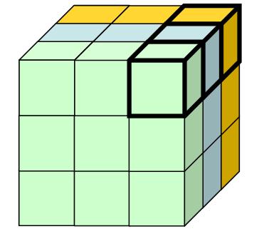
There is a second implication. The distribution of values within each layer (or subcube) is the same, for all layers along the dimension. The following picture illustrates this in three dimensions:
The three shaded layers each have the property that the sums of the expected values are the same as the sums of the original data. In addition, the distributions are the same. This means that the highlighted cell in each layer has the same proportion for all the layers.

This latter condition is actually quite a strong condition, because it imposes structure between all the cells in different layers.

Calculating Expected Values
There is actually a simple formula for calulating the expected values. The calculation starts with the sums of the values of the cells in each possible layer. The above diagram shows three layers, but this is only along one dimension. There are an additional three layers (or subcubes) along each of the other two dimensions. (The choice of 3 here is totally arbitrary; there could be any number along each dimension.)

The expected value for a cell is the ratio of two numbers:
  • The product of the sum of the values along each dimension, divided by
  • The sum in the entire table raised to the power of the number of dimensions minus one.
Let us return to the initial data in a table, with three dimensions, A, B, and C and the counts 1 through 8. What is the expected value for cell A=0, B=0, C=0?

First, we need to calculate the sums for the three layers:
  • Asum is the cells where A=0: 10=1+2+3+4
  • Bsum is the cells where B=0: 14=1+2+5+6
  • Csum is the cells where C=0: 16=1+3+5+7
  • The product is 2,240.
Second, we need the sum for the whole table, which is 36. The number of dimensions is 3, so the expected value for the cell is 2,240/36^2 = 1.73.

The other cells have similar calculations. The following shows the table with the expected values:

A B C Value Expected

0 0 0 1 1.73

0 0 1 2 2.16

0 1 0 3 2.72

0 1 1 4 3.40

1 0 0 5 4.49

1 0 1 6 5.62

1 1 0 7 7.06

1 1 1 8 8.83

Here the expected values are pretty close to the original values. This calculation is available in the accompanying spreadsheet (chi-square-blog.xls).

The calculation also readily extends to more than two dimensions. However, the condition that the distrubutions are the same along parallel subcubes becomes more and more restrictive. In two dimensions, the expected values make intuitive sense. However, as the number of dimensions grows. they may not be as intuitive. Also, by combining values along dimensions, it is possible to reduce a multidimensional case to a two-dimensional case (although some information is lost in the process).

From Expected Values to Chi-Square
The chi-square calculation itself follows the same procedure as in the two dimensional case. The chi-square for each cell is the difference between the observed and expected value squared, divided by the expected value. The chi-square for the whole table is the sum of all the chi-square values.

The degrees of freedom is calculated in a way similar to the two-dimensional case. It is the product of the size of each dimension minus 1. So, in the 2X2X2 case, the degrees of freedom is 1. In the 3X3X3X3 case, it is 16 (2*2*2*2).

The next posting will explain how to calculate the expected value using SQL.


Sunday, December 14, 2008

Multidimensional Chi-Square, Expected Values, Independence, and All That, Part 1

When I speak about data mining, I often refer to the chi-square test as my favorite statistical test. I should be more specific, though, because I am really refering to the two-dimensional chi-square test. This is described in detail in Chapter 3 of Data Analysis Using SQL and Excel, a book that I do heartily recommend and is the starting point for many ideas that I write about here.

The chi-square test can be applied to more than two dimensions. However, the multi-dimensional chi-square behaves a bit differently from the two-dimensional case. This posting describes why. The next posting describes the calculation for the multi-dimensional chi-square. And the third posting in this series will describe how to do the calculations using SQL.

Fast Overview of Chi-Square

The Chi-Square test is used when we have two or more categorical variables and counts of how often each combination appears. For instance, the following is a simple set of data in two dimensions:


A=0 B=0 1

A=0 B=1 2

A=1 B=0 3

A=1 B=1 4

This data is summarized from ten observations. The first row says that in one data record, both A and B are zero. The last row says that in four of them, both A and B are 1. In practice, when using the chi-square test, we would want higher counts -- and we would get them, because these are counts of customers (say, responders and non-responders by gender).

In two dimensions, a contingency table is perhaps a better way of looking at the counts:


B=0 B=1

A=0 1 2

A=1 3 4

The chi-square test then asks the question . . . What is the probability that the counts are produced randomly, assuming that both the A and B are independent? To answer this question, we need the expected values assuming independence between A and B. The following table shows the expected values:


B=0 B=1

A=0 1.2 1.8

A=1 2.8 4.2

The expected values have two important properties. First, the row sums and column sums are the same as the original data. So, 1+2 = 1.2+1.8 = 3, and so on for both rows and both columns.

The second property is a little more subtle, but it says that the ratios of values in any column or any row are the same. So, 1.2/1.8 = 2.8/4.2 = 2/3, and so on. Of all possible 2X2 matrices, there is only one that has both these properties.

Now, the chi-square value for any cell is the square of the difference between the actual value and the expected value divided by the expected value. The chi-square for the matrix is the sum of the chi-square values for all the cells. These follow a chi-square distribution with one degree of freedom, and this gives us a enough information to determine whether the original counts are likely due to chance.

Calculating expected values is easy. The expected value for any cell is the product of the row sum times the column sum divided by the total in the table. For example, for A=0, B=0, the row sum is 3 and the column sum is 4. The product is 12, so the expected value is 1.2 = 12/10.

Treating Three Dimensions As Two Dimensions
Now, let's assume that the data has three dimensions rather than two. For example:

A=0 B=0 C=0 1

A=0 B=0 C=1 2

A=0 B=1 C=0 3

A=0 B=1 C=1 4

A=1 B=0 C=0 5

A=1 B=0 C=1 6

A=1 B=1 C=0 7

A=1 B=1 C=1 8

We can treat this as a contingency table in two dimensions:


C=0 C=1

A=0,B=0 1 5

A=0,B=1 2 6

A=1,B=0 3 7

A=1,B=1 4 8

And from this we can readily calculate the expected values:


C=0 C=1

A=0,B=0 1.67 4.33

A=0,B=1 2.22 5.78

A=1,B=0 2.78 7.22

A=1,B=1 3.33 8.67

The chi-square calculation follows as in the earlier case. The chi-square value for each cell is the actual count minus the expected value squared divided by the expected value. The chi-square value for the entire table is the sum of all the chi-square values for each cell.

The only difference here is that there are three degrees of freedom. This affects how to transform the chi-square value into a probability, but it does not affect the computation.

Which Are the Right Expected Values?
There are actually two other continency tables that we might produce from the original 2X2X2 data, depending on which dimension we use for the columns:


B=0 B=1

A=0,C=0 1 2

A=0,C=1 5 6

A=1,C=0 3 4

A=1,C=1 7 8

and


A=0 A=1

B=0,C=0 1 3

B=0,C=1 5 7

B=1,C=0 2 4

B=1,C=1 6 8

Following the same procedure, we can calcualte the expected values for each of these.


B=0 B=1

A=0,C=0 1.33 1.67

A=0,C=1 4.89 6.11

A=1,C=0 3.11 3.89

A=1,C=1 6.67 8.33

and


B=0 B=1

A=0,C=0 1.78 2.22

A=0,C=1 5.33 6.67

A=1,C=0 2.67 3.33

A=1,C=1 6.22 7.78

Oops!. The three sets of expected values are different from each other. Which do we use for the 2X2X2 chi-square calculation?

Why Independence is a Strong Condition
The answer is none of these. For the three dimensional data (and higher dimensional as well), the three contingency tables are almost always going to be different, because they mean different things. This is perhaps best viewed geometrically:


In this cube, the front face corresponds to C=0 and the hidden face to C=1. The A values go horizontally and the B's vertically. The three different contingency tables are formed by cutting the cube in half and then pasting the halves together. These tables are different.

For instance, the front face and the back facee are each 2X2 contingency tables. The expected values for these can be determined just from the information on each face. We do not need the information along the C dimension for this calculation. Worse, we cannot even use this information -- so there is no way to ensure that the sums along the "C" dimension add up to the same values in the original data and for the expected values.

The problem is that the sums along each dimension overspecify the problem. A given value has three adjacent values along three dimensions. However, only two of the dimensions are needed to calcualte an expected value, assuming independence along those two dimensions. The information along the third dimension cannot be incorporated into the calculation.

The reason? Independence is a very strong condition. Remember, it says not only that the sums are the same but also that the ratios within each row (or column or layer) are the same. Normally, we might think "independent" variables are providing as much flexibility as possible. However, that is not the case. In fact, the original counts are the only ones that meet the all the conditions of independence at the level of every row, colum, and level.

When I think of this situation, I think of a paradox related to the random distribution of stars. We actually perceive a random distribution as more ordered. Check out this site for an example. Similarly, our intuition is that independence among variables is a weak condition. In fact, it can be quite a strong condition.

The next posting will explain how expected values work in three and more dimensions. For now, it is worth explaining that converting a three-dimensional problem into two dimensions is often feasible and reasonable. This is particularly true when one of the dimensions is a "response" characteristic and the rest are input dimensions. However, such a 2X2 table is really an approximation.